
August 1, 2013
We recently had a paper come out in a special issue on article-level metrics in the journal Information Standards Quarterly. Our paper basically compared article-level metrics provided by different aggregators. The other papers covered various article-level metrics topics from folks at PLOS, Mendeley, and more. Get our paper.
To get data from the article-level metrics providers we used one R package we created to get DOIs for PLOS articles (rplos) and three R packages we created to get metrics: alm, rImpactStory, and rAltmetric. Here, we will show how we produced visualizations in the paper. The code here is basically that used in the paper - but modified to make it useable by you hopefully.
Note that this entire workflow is in a Github gist. In addition, you will need to sign up for API keys for ImpactStory and Altmetric.
 First, let’s get some data
Install these packages if you don’t have them. Most packages are on CRAN, but install the following packages from Github: rplos, alm, rImpactStory, and rAltmetric by running install_github("PACKAGE_NAME", "ropensci").
library(alm)
library(rImpactStory)
library(rAltmetric)
library(ggplot2)
library(rplos)
library(reshape)
library(reshape2)
library(httr)
library(lubridate)
Define a function parse_is to parse ImpactStory results
See this gist for the function
Define a function compare_altmet_prov to collect altmetrics from three providers
See this gist for the function
Safe version in case of errors
compare_altmet_prov_safe <- plyr::failwith(NULL, compare_altmet_prov)
Search for and get DOIs for 50 papers (we used more in the paper)
res <- searchplos(terms = "*:*", fields = "id", toquery = list("publication_date:[2011-06-30T00:00:00Z TO 2012-06-01T23:59:59Z] ", "doc_type:full"), start = 0, limit = 50)
Get data from each provider
dat <- llply(as.character(res[, 1]), compare_altmet_prov_safe, isaddifnot = TRUE, sleep = 1, .progress = "text")
dat <- ldply(dat)
Plot differences
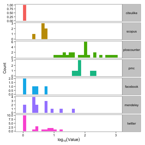
Great, we have data! Next, let’s make a plot of the difference between max and min value across the three providers for 7 article-level metrics.
alldat <- sort_df(dat, "doi")

dat_split <- split(alldat, f = alldat$doi)
dat_split <- dat_split[!sapply(dat_split, nrow) == 0]
dat_split <- compact(lapply(dat_split, function(x) {
    if (x$citeulike[2] == 999) {
        NULL
    } else (x)
}))
dat_split_df <- ldply(dat_split)[, -1]

calcdiff <- function(x) {
    max(na.omit(x)) - min(na.omit(x))
}

dat_split_df_1 <- ddply(dat_split_df, .(doi), numcolwise(calcdiff))
dat_split_df_melt <- melt(dat_split_df_1)

dat_split_df_melt <- dat_split_df_melt[!dat_split_df_melt$variable %in% "connotea", ]

ggplot(dat_split_df_melt, aes(x = log10(value), fill = variable)) +
    theme_bw(base_size = 14) +
    geom_bar() +
    scale_fill_discrete(name = "Almetric") +
    facet_grid(variable ~ ., scales = "free") +
    labs(x = expression(log[10](Value)), y = "Count") +
    theme(strip.text.y = element_text(angle = 0),
        panel.grid.major = element_blank(),
        panel.grid.minor = element_blank(),
        legend.position = "none",
        panel.border = element_rect(size = 1))
gistr map
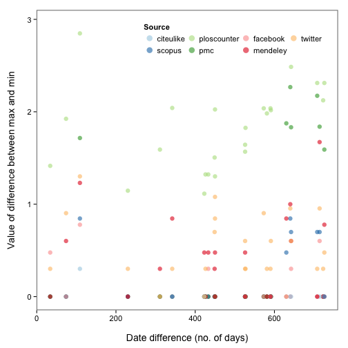
Different collection dates?
Okay, so there are some inconsistencies in data from different providers. Perhaps the same metric (e.g., tweets) were collected on different days for each provider? Let’s take a look. We first define a function to get the difference in days between a vector of values, then apply that function over the data for each metric. We then reshape the data a bit using the reshape2 package, and make the plot.
datediff <- function(x) {
    datesorted <- sort(x)
    round(as.numeric(difftime(datesorted[3], datesorted[1])), 0)
}

dat_split_df_1 <- ddply(dat_split_df, .(doi), numcolwise(calcdiff))
dat_split_df_2 <- ddply(dat_split_df, .(doi), summarise, datediff = datediff(date_modified))
dat_split_df_melt <- melt(dat_split_df_1)
dat_split_df_ <- merge(dat_split_df_melt, dat_split_df_2, by = "doi")
dat_split_df_melt <- dat_split_df_[!dat_split_df_$variable %in% "connotea", ]

ggplot(dat_split_df_melt, aes(x = datediff, y = log10(value + 1), colour = variable)) +
    theme_bw(base_size = 14) +
    geom_point(size = 3, alpha = 0.6) +
    scale_colour_brewer("Source", type = "qual", palette = 3) +
    theme(panel.grid.major = element_blank(),
        panel.grid.minor = element_blank(),
        legend.position = c(0.65, 0.9),
        panel.border = element_rect(size = 1),
        legend.key = element_blank(),
        panel.background = element_rect(colour = "white")) +
    guides(col = guide_legend(nrow = 2, override.aes = list(size = 4))) +
    labs(x = "\nDate difference (no. of days)", y = "Value of difference between max and min\n")
gistr map
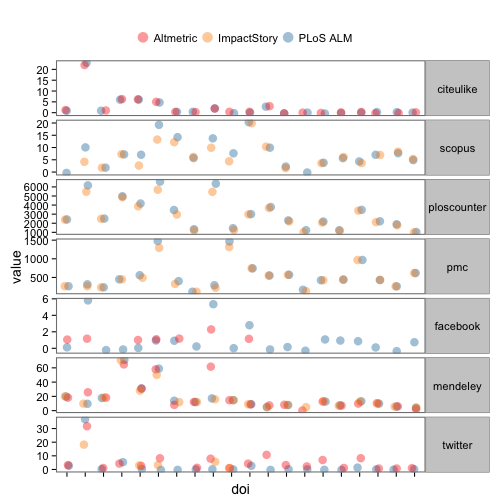
Diggin’ in
Let’s dig in to indivdual articles. Here, we reshape some data, selecting just 20 DOIs (i.e., papers), and plot the values of each metric for each DOI, coloring points by provider. Note that points are slightly offset horizontally to make them easier to see.
alldat_m <- melt(dat_split_df[1:60,], id.vars=c(1,2,11))
alldat_m <- alldat_m[!alldat_m$variable %in% "connotea",]

ggplot(na.omit(alldat_m[,-3]), aes(x=doi, y=value, colour=provider)) +
  theme_bw(base_size = 14) +
  geom_point(size=4, alpha=0.4, position=position_jitter(width=0.15)) +
  scale_colour_manual(values = c('#FC1D00','#FD8A00','#0D71A5','#2CCC00')) +
  facet_grid(variable~., scales='free') +
  theme(axis.text.x=element_blank(),
        strip.text.y=element_text(angle = 0),
        legend.position="top",
        legend.key = element_blank(),
        panel.border = element_rect(size=1),
        panel.grid.major = element_blank(),
        panel.grid.minor = element_blank()) +
  guides(col = guide_legend(title="", override.aes=list(size=5), nrow = 1, byrow = TRUE))
gistr map
